

Styling
Challenges
Current challenges
- Standardising style configuration:
- themes
- colours
- animation
- elevation
- typography
- grid
- breakpoints
- iconography
- naming conventions
- style order
- rules for classing
- relation to design
- Standardising file system layout:
- themes
- flexibility
- subdirectory structure (images, fonts, utils)
- Code quality
- documentaiton
- testing
- reusability
- callback ability when updating repos
- accessibility
- dependency abuse
- Resources
- references and direction
- onboarding
Naming challenges
A list of challeneges when thinking of naming conventions:
- How can styling conventions apply between frameworks?
- What conventions do we need to sacrifice between different frameworks?
- How is this consumable for both the dev and designer ecosystem?
- What file structures do we incorporate between partials to make them easily reusable.
- How can we define class names that work for all the different types of code we write?
- How can we efficiently document and test our code?
- How can we maintain consistency in the way we write our styling?
- How can we enforce accessible, high standards for our HTML?
- How can we decouple and standardise things such as grids, animation speeds, iconography etc.?
Naming conventions
Links
Types
Predetermined types by level:
body: header:# @classname header # @children # Top level for each section section: # @classname section-name # @children container: # @classname container-name # Base selection of rules block: # @children grid: grid-item: # @children table: # @children table-header: # @children table-data: # @chidlren list: # react native only list-item: # @children # ... more, maybe article etc nav: nav-item: # @children component: # @classname component-name # Specific component based styling # @children # Base selection of rules block: # @children grid: grid-item: # @children table: # @children table-header: # @children table-data: # @chidlren list: # react native only list-item: # @children # ... more, maybe article etc nav: nav-item: # @children footer:# @classname footer - but maybe should be more specific # @children
Ordering
.selector { /* Mixins + Extends */ @extend .selector-to-extend-from; @include mixin; /* Positioning */ position: absolute; z-index: 10; top: 0; right: 0; /* Display & Box Model */ display: inline-block; overflow: hidden; box-sizing: border-box; padding: 10px; border: 10px solid #333; margin: 10px; /* Sizing */ max-width: 100px; width: 100%; height: 100px; /* Background */ background-color: #000; /* Text */ font-family: sans-serif; font-size: 16px; line-height: 1.4; text-align: right; color: #fff /* Transitions */ transition: all $speed ease-out; /* Other */ cursor: pointer; /* Modifiers */ &:last-of-type { // Repeat Ordering Rules } &:hover, &:focus { // Repeat Ordering Rules } /* Media Breaks */ @include grid-media($mobile-grid) { // Repeat Ordering Rules } /* Second-tier elements */ .selector-child { // Repeat Ordering Rules // ! Do not bleed further than one more tier } }
Example layout

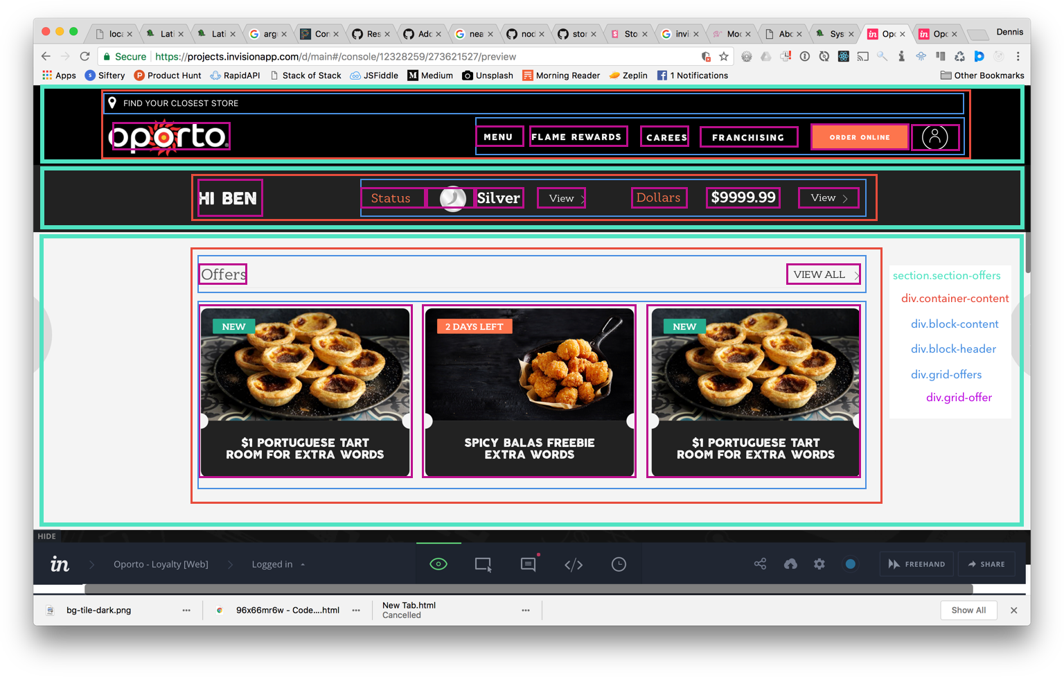
Example layout
The aim is that regardless of whether or not we are using a template engine, JSX, html or whatever that uses/doesn't use partials or components of some form that we are able to maintain consistency.
In the above image, let's look at how we would implement in a template engine like twig and then in React:
<!-- Section partial ~/partials/page-offers/section-offers.twig (TODO: decide naming strutures?) --> <section class="section-offers"> <div class="container-content"> <div class="block-content"></div> <div class="block-header"></div> <div class="grid-offers"> {% for offer in offers %} <div class="grid-offer"> {% include 'partials/component-offer/offer.twig' with {offer: offer} %} </div> {% endfor %} </div> </div> </section> <!-- Section partial ~/partials/page-offers/component-offer.twig (TODO: decide naming strutures?) --> <div class="component-offer"> <div class="block-image"> <img src="{{ offer.imgSource }}" alt="{{ offer.alt }}" class="offer-image" /> </div> <div class="block-title"> <h3 class="offer-title">{{ offer.title }}</h3> </div> </div>
// components/SectionOffers/index.js import React, { Component } from 'react'; import Images from 'img/Image'; import Offer from 'components/Offer'; class SectionOffers extends Component { constructor(props) { super(props); this.state = { offers = [...] }; } /** * Render the <Home /> component * @return {Home} Home page component */ render() { const { membershipCardId, profile } = this.props; console.log(this.state.renderCode); return ( <section className="section-offers"> <div className="container-content"> <div className="block-content"></div> <div className="block-header"></div> <div className="grid-offers"> {offers.map(d, i) => ( <div className="grid-offer"> <Offer offer={d} /> </div> )} </div> </div> </section> ); } } export default SectionOffers; // components/Offer/index.js // ENSURE THAT ANY COMPONENT WE BUILD FOR // IS STATELESS import React, { Component } from 'react'; import { Link } from 'react-router'; import Images from 'img/Image'; export default Offer = (props) => ( <div className="component-offer"> <div className="block-image"> <img src={props.imgSource} alt={props.imgAlt} className="offer-image"> </div> <div className="block-title"> <h3 className="offer-title">{props.offerTitle</h3> </div> </div> );
// in other base files // base/_container.scss .container { // keep vars elsewhere max-width: $max-width; // center margin: 0 auto; // set base padding rules // containers should only have padding padding: 80px 20px; // set base overrides @include grid-media($mobile) { padding: 10px; } } // base/_block.scss .block { // if blocks get basic rules } // base/_grid.scss .grid { // our base grid rules // given we are enforcing STANDARD rules // ensure you use the direct child selector > .grid-item { // item rules } } // Component or partial: SectionOffers // sections/_section-offers.scss // every file should only go three levels deep // level one: parent // level two: any child of parent (parent should prevent bleed through) // level three: modifiers, sibling classes, media breaks .section-offers { // should handle: // padding // background color padding: 80px 20px; @include grid-media($mobile) { padding: 40px 20px; } .container-content { // should handle central gutter @extend .container; // ^ brings in things like margin: 0 auto; } .block-content { // blocks should only have margin-bottom margin-bottom: 20px; @include grid-media($mobile) { } } .block-header { } // another pre-determined type .grid-offers { @extend .grid; } // note that this is still level two // and doesn't fall in component scss .grid-offer { @extend .grid-item; } } // components or react level styling // components/_offers.scss .component-offer { // begin rules again position: relative; // ... .block-image { // ... } .offer-image { // ... } .block-title { // ... } .offer-title { // ... } }
In the case of a React Native app, set the styles object to be equivalent but without nesting:
// Component or partial: SectionOffers // sections/_section-offers.scss // every file should only go three levels deep // level one: parent // level two: any child of parent (parent should prevent bleed through) // level three: modifiers, sibling classes, media breaks const sectionOffers = { containerContent { @extend .container; } blockContent { // blocks should only have margin-bottom margin-bottom: 20px; @include grid-media($mobile) { } } blockHeader { } // another pre-determined type gridOffers { @extend .grid; } // note that this is still level two // and doesn't fall in component scss gridOffer { @extend .grid-item; } } // Offer component const styles = { // components or react level styling // components/_offers.scss offer: { // begin rules again position: "relative"; // ... } offerimage: { // ... } offerTitle { // ... } }
Sass Principles
Checklist
- Is it responsive?
@include grid-mediaincluded? - :hover states?
- :focus states?
- Active/Inactive states?
- Enabled/Disabled states?
- Primary/Secondary/Alt?
- Sizing?
- Shape?
Utilities
Text (f-)
Font primary example:
.f-primary { &.display-four { @include display-four; @include f-primary; } &.display-three { @include display-three; @include f-primary; } &.display-two { @include display-two; @include f-primary; } &.display-one { @include display-one; @include f-primary; } &.headline { @include headline; @include f-primary; } &.title { @include title; @include f-primary; } &.subheading { @include subheading; @include f-primary; } &.body-two { @include body-two; @include f-primary; } &.body-one { @include body-two; @include f-primary; } &.caption { @include caption; @include f-primary; } &.cta { @include cta; @include f-primary; } &.center { text-align: center; } &.left { text-align: left; } &.right { text-align: right; } }
animate (a-)
$a-desktop: 390ms; $a-desktop-enter: 290ms; $a-desktop-exit: 250ms; $a-mobile: 300ms; $a-mobile-enter: 225ms; $a-mobile-exit: 195ms; .animate { transition: all $a-desktop-exit ease-out; @include grid-media($mobile-grid) { transition-duration: $a-mobile-exit; } }
color (c-) and background-colour (bg-)
// Flat Colours $c-blue: #3498db; $c-green: #2ecc71; $c-purple: #9b59b6; $c-yellow: #f1c40f; $c-orange: #f39c12; $c-red: #e74c3c; $c-light-grey: #ecf0f1; $c-grey: #bdc3c7; // Basics $c-black: #000; $c-white: #fff; // Setting the states $c-primary: #ecf0f1; $c-secondary: #bdc3c7; $c-link: #3498db; $c-info: #3498db; $c-success: #2ecc71; $c-error: #e74c3c; $c-warning: #f1c40f; $c-light: #ecf0f1; $c-dark: #222; /* Colors: c-primary c-secondary c-success c-error c-warning c-light c-dark c-white c-black c-link c-grey c-grey-light */ .bg-primary { background-color: $c-primary; &.-hover { @include backgroundColor($c-primary); } } .c-primary { color: $c-primary; &.-hover { @include color($c-primary); } } .bg-secondary { background-color: $c-secondary; &.-hover { @include backgroundColor($c-secondary); } } .c-secondary { color: $c-secondary; &.-hover { @include color($c-secondary); } } // Black and whites .bg-black { background-color: $c-black; } .c-black { color: $c-black; } .bg-white { background-color: $c-white; } .c-white { color: $c-white; } // Other .bg-link { background-color: $c-link; } .c-link { color: $c-link; } .bg-info { background-color: $c-info; } .c-info { color: $c-info; } .bg-success { background-color: $c-success; } .c-success { color: $c-success; } .bg-error { background-color: $c-error; } .c-error { color: $c-error; } .bg-warning { background-color: $c-warning; } .c-warning { color: $c-warning; } .bg-light { background-color: $c-light; } .c-light { color: $c-light; } .bg-dark { background-color: $c-dark; } .c-dark { color: $c-dark; } // Base colours -- may remove .bg-blue { background-color: $c-blue; &.-hover { @include backgroundColor($c-blue); } } .c-blue { color: $c-blue; &.-hover { @include color($c-blue); } } .bg-green { background-color: $c-green; &.-hover { @include backgroundColor($c-green); } } .c-green { color: $c-green; &.-hover { @include color($c-green); } } .bg-purple { background-color: $c-purple; &.-hover { @include backgroundColor($c-purple); } } .c-purple { color: $c-purple; &.-hover { @include color($c-purple); } } .bg-yellow { background-color: $c-yellow; &.-hover { @include backgroundColor($c-yellow); } } .c-yellow { color: $c-yellow; &.-hover { @include color($c-yellow); } } .bg-orange { background-color: $c-orange; &.-hover { @include backgroundColor($c-orange); } } .c-orange { color: $c-orange; &.-hover { @include color($c-orange); } } .bg-red { background-color: $c-red; &.-hover { @include backgroundColor($c-red); } } .c-red { color: $c-red; &.-hover { @include color($c-red); } } .bg-light-grey { background-color: $c-light-grey; &.-hover { @include backgroundColor($c-light-grey); } } .c-light-grey { color: $c-light-grey; &.-hover { @include color($c-light-grey); } } .bg-grey { background-color: $c-grey; &.-hover { @include backgroundColor($c-grey); } } .c-grey { color: $c-grey; &.-hover { @include color($c-grey); } }
padding (p-) & margin-bottom (mb-) — only used for blocks
Still to do.
Components
Button
.button { padding: 16px 20px; &.primary { background-color: $c-black; border: $c-black 1px solid; color: $c-white; } &.secondary { background-color: $c-white; border: $c-black 1px solid; color: $c-black; } &.cta { @include cta; font-size: 1.4rem; text-transform: uppercase; } &.center { text-align: center; } }
Grid
$mobile-grid: ( columns: 4, gutter: 10px, media: $mobile, ); $tablet-p-grid: ( columns: 4, gutter: 50px, media: $tablet-p, ); $tablet-l-grid: ( columns: 12, gutter: 50px, media: $tablet-l, ); // Grid .grid-container { @include grid-container; } .grid { max-width: $max-width; // Item > .grid-item, > .item { margin-bottom: 10px; // Grid Push &.push-one { @include grid-push(1); } &.push-two { @include grid-push(2); } &.push-three { @include grid-push(3); } &.push-four { @include grid-push(4); } &.push-five { @include grid-push(5); } &.push-six { @include grid-push(6); } &.push-seven { @include grid-push(7); } &.push-eight { @include grid-push(8); } &.push-nine { @include grid-push(9); } &.push-ten { @include grid-push(10); } &.push-eleven { @include grid-push(11); } &.push-twelve { @include grid-push(12); } // Grid Shifts &.shift-one { @include grid-shift(1); } &.shift-two { @include grid-shift(2); } &.shift-three { @include grid-shift(3); } &.shift-four { @include grid-shift(4); } &.shift-five { @include grid-shift(5); } &.shift-six { @include grid-shift(6); } &.shift-seven { @include grid-shift(7); } &.shift-eight { @include grid-shift(8); } &.shift-nine { @include grid-shift(9); } &.shift-ten { @include grid-shift(10); } &.shift-eleven { @include grid-shift(11); } &.shift-twelve { @include grid-shift(12); } // Grid Column @include grid-column(12); &.one { @include grid-column(1); } &.two { @include grid-column(2); } &.three { @include grid-column(3); } &.four { @include grid-column(4); } &.five { @include grid-column(5); } &.six { @include grid-column(6); } &.seven { @include grid-column(7); } &.eight { @include grid-column(8); } &.nine { @include grid-column(9); } &.ten { @include grid-column(10); } &.eleven { @include grid-column(11); } &.twelve { @include grid-column(12); } @include grid-media($mobile-grid) { @include grid-column(4); &.one, &.two, &.three, &.four, &.five, &.six, &.seven, &.eight, &.nine, &.ten, &.eleven, &.twelve { @include grid-column(4); } } } }
Container
.container { &.content { margin: 0 auto; max-width: $max-width; } &.pad { padding: 60px 20px; @include grid-media($mobile-grid) { padding: 20px 10px; } } &.flex { display: flex; align-items: center; justify-content: center; } }
Block
Alert
Breadcrumb
Structure
The structure can be continually updated as time goes along, but there are some basic Sass principles to ahere to.
1. Keywords should wrap everything and not be duplicated
Keywords should be use to help define the shape and styling of a component. Using other references like Bootstrap etc are not a bad idea.
The scoping should ensure there is no bleeding into other components.
/* Example keyword: button */ .button { /* Scope should mean .button.sm and .button.lg do not affect other uses ie .icon.sm */ &.sm { padding: 10px; } &.lg { padding: 20px; } }
2. Keep consistent, minimal states
Using the same method before, we can create sibling classes that are within scope. Use action adjectives.
.button { /* Consider these sibling classes state classes */ &.disabled { } &.active { } &.inactive { } &.focus { } &.inactive { } }
3. Keep component colouring modifiable by using colour classes
To enable overrides using lift and kratos, be smart for components you want to modify.
Do this:
<div class="block bg-primary"> <p>Stuff within div</p> <div></div> </div>
Not this:
<div class="block"> <p>Stuff within div</p> <div></div> </div>
.block { background-color: $c-primary; // unless setting a fallback }
4. Prefix attribute-specific utility classes
Instead of your standard keywords like button for components, prefix the utility classes like c-primary for color primary and bg-primary for background primary.
The exception to this utility rule should be animate which is just a keyword to trigger a global style of animations for changing between states based on Google's animation guidelines and text.
Base Mixins
The mixins file is the place to store all of the functional Sass mixins used throughout the project.
inline-block-list
// inline-block list @mixin inline-block-list($padding: false) { margin: 0; padding: 0; border: 0; @include clearfix; li { list-style-type: none; @include inline-block(); white-space: nowrap; @if $padding { padding: { left: $padding; right: $padding; } } } }
omega-reset
@mixin omega-reset($nth) { &:nth-child(#{$nth}) { margin-right: flex-gutter(); } &:nth-child(#{$nth} + 1) { clear: none; } }
font-size
@mixin font-size($fontSize, $lineHeight: null) { font-size: $fontSize; font-size: rem($fontSize) / 0.625; @if ($lineHeight) { line-height: em($lineHeight, $fontSize); } @else { line-height: inherit; } }
inline-block
// inline-block for old browsers @mixin inline-block() { display: inline-block; *zoom: 1; *display: inline; }
reset-box-model
@mixin reset-box-model { margin: 0; padding: 0; border: 0; }
absolute-fill
@mixin absolute-fill { position: absolute; top: 0; left: 0; width: 100%; height: 100%; }
headings
@mixin headings($from: 1, $to: 6) { @for $i from $from through $to { h#{$i} { @content; } } }
background-image
@mixin background-image($path) { background-image: url(../img/#{$path}.png); background-image: linear-gradient(transparent, transparent), url(../img/#{$path}.svg); }
reset-ul
/* Reset unordered list style */ @mixin reset-ul { list-style-type: none; margin: 0; padding: 0; overflow: auto; }
hide-text
@mixin hide-text { overflow: hidden; text-indent: 101%; white-space: nowrap; }
_neat-parse-media
Swaps neat 2.0 to desktop first
@function _neat-parse-media($media) { @if type-of($media) == number { @return "only screen and (max-width: #{$media})"; } @else if type-of($media) == string { @return "#{$media}"; } }
background-color
Set default background-color transition.
@mixin background-color$color, $lighten: false) { background-color: $color; transition: background-color 600ms ease-in; &:hover, &:active { @if $lighten { background-color: lighten($color, 30%); } @else { background-color: darken($color, 30%); } } }
color
@mixin color($color, $lighten: false) { color: $color; transition: color 600ms ease-in; &:hover, &:active { @if $lighten { color: lighten($color, 30%); } @else { color: darken($color, 30%); } } }
File Structure Guidelines
Note that sections and components should be component bound and flexible. Static sites may require the SCSS in the main directory but couple the styles with the section/template/component when possible and delay imports using things such as Webpack.
. ├── base │ ├── __mixins.scss │ ├── _animations.scss │ ├── _breakpoints.scss │ ├── _colours.scss │ ├── _elevation.scss │ ├── _icons.scss │ ├── _layout.scss │ └── _typography.scss ├── components │ ├── _button.scss │ └── _grid.scss ├── fonts │ ├── font-name-one.ttf │ └── font-name-two.ttf ├── main.scss └── sections └── _landing-one.scss