

Styling Guidelines and Principles
Challenges
Current challenges
- Standardising style configuration:
- themes
- colours
- animation
- elevation
- typography
- grid
- breakpoints
- iconography
- naming conventions
- style order
- rules for classing
- relation to design
- Standardising file system layout:
- themes
- flexibility
- subdirectory structure (images, fonts, utils)
- Code quality
- documentaiton
- testing
- reusability
- callback ability when updating repos
- accessibility
- dependency abuse
- Resources
- references and direction
- onboarding
Naming challenges
A list of challeneges when thinking of naming conventions:
- How can styling conventions apply between frameworks?
- What conventions do we need to sacrifice between different frameworks?
- How is this consumable for both the dev and designer ecosystem?
- What file structures do we incorporate between partials to make them easily reusable.
- How can we define class names that work for all the different types of code we write?
- How can we efficiently document and test our code?
- How can we maintain consistency in the way we write our styling?
- How can we enforce accessible, high standards for our HTML?
- How can we decouple and standardise things such as grids, animation speeds, iconography etc.?
Naming conventions
Links
Types
Predetermined types by level:
body: header:# @classname header # @children # Top level for each section section: # @classname section-name # @children container: # @classname container-name # Base selection of rules block: # @children grid: grid-item: # @children table: # @children table-header: # @children table-data: # @chidlren list: # react native only list-item: # @children # ... more, maybe article etc nav: nav-item: # @children component: # @classname component-name # Specific component based styling # @children # Base selection of rules block: # @children grid: grid-item: # @children table: # @children table-header: # @children table-data: # @chidlren list: # react native only list-item: # @children # ... more, maybe article etc nav: nav-item: # @children footer:# @classname footer - but maybe should be more specific # @children
Ordering
.selector { /* Mixins + Extends */ @extend .selector-to-extend-from; @include mixin; /* Positioning */ position: absolute; z-index: 10; top: 0; right: 0; /* Display & Box Model */ display: inline-block; overflow: hidden; box-sizing: border-box; padding: 10px; border: 10px solid #333; margin: 10px; /* Sizing */ max-width: 100px; width: 100%; height: 100px; /* Background */ background-color: #000; /* Text */ font-family: sans-serif; font-size: 16px; line-height: 1.4; text-align: right; color: #fff /* Transitions */ transition: all $speed ease-out; /* Other */ cursor: pointer; /* Modifiers */ &:last-of-type { // Repeat Ordering Rules } &:hover, &:focus { // Repeat Ordering Rules } /* Media Breaks */ @include grid-media($mobile-grid) { // Repeat Ordering Rules } /* Second-tier elements */ .selector-child { // Repeat Ordering Rules } }
Example layout

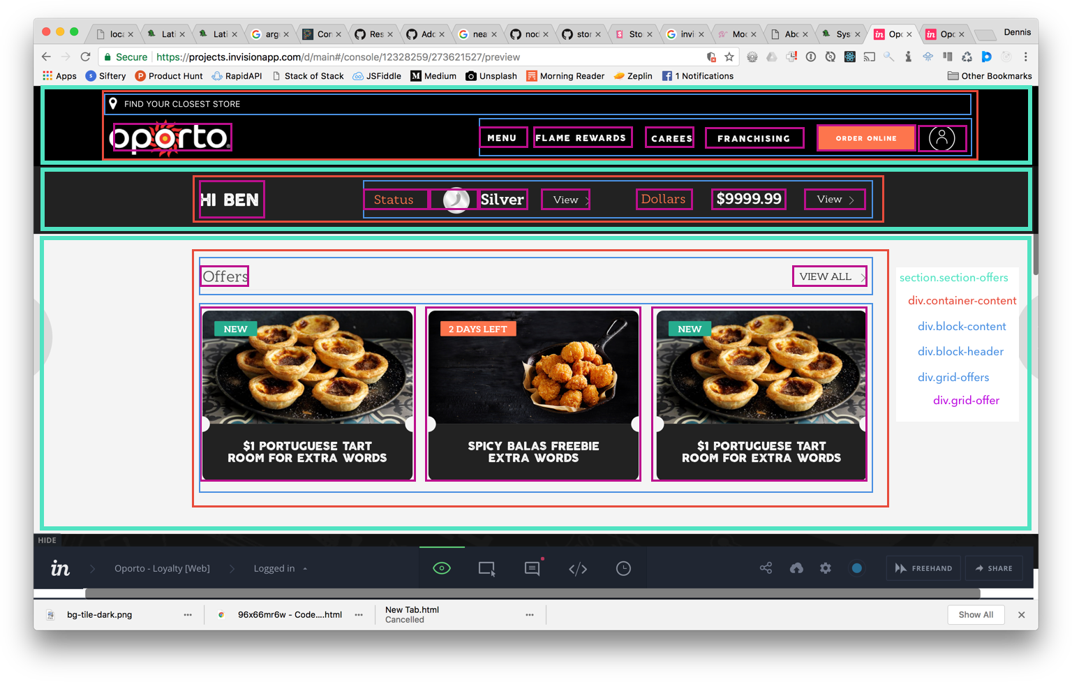
Example layout
The aim is that regardless of whether or not we are using a template engine, JSX, html or whatever that uses/doesn't use partials or components of some form that we are able to maintain consistency.
In the above image, let's look at how we would implement in a template engine like twig and then in React:
<!-- Section partial ~/partials/page-offers/section-offers.twig (TODO: decide naming strutures?) --> <section class="section-offers"> <div class="container-content"> <div class="block-content"></div> <div class="block-header"></div> <div class="grid-offers"> {% for offer in offers %} <div class="grid-offer"> {% include 'partials/component-offer/offer.twig' with {offer: offer} %} </div> {% endfor %} </div> </div> </section> <!-- Section partial ~/partials/page-offers/component-offer.twig (TODO: decide naming strutures?) --> <div class="component-offer"> <div class="block-image"> <img src="{{ offer.imgSource }}" alt="{{ offer.alt }}" class="offer-image" /> </div> <div class="block-title"> <h3 class="offer-title">{{ offer.title }}</h3> </div> </div>
// components/SectionOffers/index.js import React, { Component } from 'react'; import Images from 'img/Image'; import Offer from 'components/Offer'; class SectionOffers extends Component { constructor(props) { super(props); this.state = { offers = [...] }; } /** * Render the <Home /> component * @return {Home} Home page component */ render() { const { membershipCardId, profile } = this.props; console.log(this.state.renderCode); return ( <section className="section-offers"> <div className="container-content"> <div className="block-content"></div> <div className="block-header"></div> <div className="grid-offers"> {offers.map(d, i) => ( <div className="grid-offer"> <Offer offer={d} /> </div> )} </div> </div> </section> ); } } export default SectionOffers; // components/Offer/index.js // ENSURE THAT ANY COMPONENT WE BUILD FOR // IS STATELESS import React, { Component } from 'react'; import { Link } from 'react-router'; import Images from 'img/Image'; export default Offer = (props) => ( <div className="component-offer"> <div className="block-image"> <img src={props.imgSource} alt={props.imgAlt} className="offer-image"> </div> <div className="block-title"> <h3 className="offer-title">{props.offerTitle</h3> </div> </div> );
// in other base files // base/_container.scss .container { // keep vars elsewhere max-width: $max-width; // center margin: 0 auto; // set base padding rules // containers should only have padding padding: 80px 20px; // set base overrides @include grid-media($mobile) { padding: 10px; } } // base/_block.scss .block { // if blocks get basic rules } // base/_grid.scss .grid { // our base grid rules // given we are enforcing STANDARD rules // ensure you use the direct child selector > .grid-item { // item rules } } // Component or partial: SectionOffers // sections/_section-offers.scss // every file should only go three levels deep // level one: parent // level two: any child of parent (parent should prevent bleed through) // level three: modifiers, sibling classes, media breaks .section-offers { // should handle: // padding // background color padding: 80px 20px; @include grid-media($mobile) { padding: 40px 20px; } .container-content { // should handle central gutter @extend .container; // ^ brings in things like margin: 0 auto; } .block-content { // blocks should only have margin-bottom margin-bottom: 20px; @include grid-media($mobile) { } } .block-header { } // another pre-determined type .grid-offers { @extend .grid; } // note that this is still level two // and doesn't fall in component scss .grid-offer { @extend .grid-item; } } // components or react level styling // components/_offers.scss .component-offer { // begin rules again position: relative; // ... .block-image { // ... } .offer-image { // ... } .block-title { // ... } .offer-title { // ... } }
In the case of a React Native app, set the styles object to be equivalent but without nesting:
// Component or partial: SectionOffers // sections/_section-offers.scss // every file should only go three levels deep // level one: parent // level two: any child of parent (parent should prevent bleed through) // level three: modifiers, sibling classes, media breaks const sectionOffers = { containerContent { @extend .container; } blockContent { // blocks should only have margin-bottom margin-bottom: 20px; @include grid-media($mobile) { } } blockHeader { } // another pre-determined type gridOffers { @extend .grid; } // note that this is still level two // and doesn't fall in component scss gridOffer { @extend .grid-item; } } // Offer component const styles = { // components or react level styling // components/_offers.scss offer: { // begin rules again position: "relative"; // ... } offerimage: { // ... } offerTitle { // ... } }